FEATURED IN JANUARY

SET OF ADRIAN PEARSALL WINGBACK CHAIRS + OTTOMANS

The history of the wingback chair goes back at least as far as the 17th century. Its original purpose was to keep out the drafts of cold air while sitting by the fire. Since then, it has come a long way, and because of its unusual shape, many designers have used it as a chance to elaborate on their distinct forms. This Model 2231-C Wingback Chair with ottomans is no exception. Pearsall’s Atomic Age shapes beautifully compliment the wingback format. His fusion of traditional woodworking with dynamic lines created a timeless piece of American furniture that would look good in nearly any home.

NIELS BENDTSEN COFFEE TABLE

Niels Bendtsen is a Danish-Canadian designer whose education traces back to Jacob Kjær, the designer of the FN chair used at the United Nations. Niels Bendtsen’s father studied directly with Kjær, while Niels apprenticed in his father’s cabinet making shop. Although Bendtsen’s design focuses much more on using metal and glass, it is easy to see the Danish tradition in his pieces. Tight curves accentuate a restrained, minimal design. Because he can rely on the strength of the materials, the table itself has thin, reduced parts that create an elegant structure that both frames and supports the piece. This table has been refinished in a vibrant fuschia that accentuates its futuristic character.  

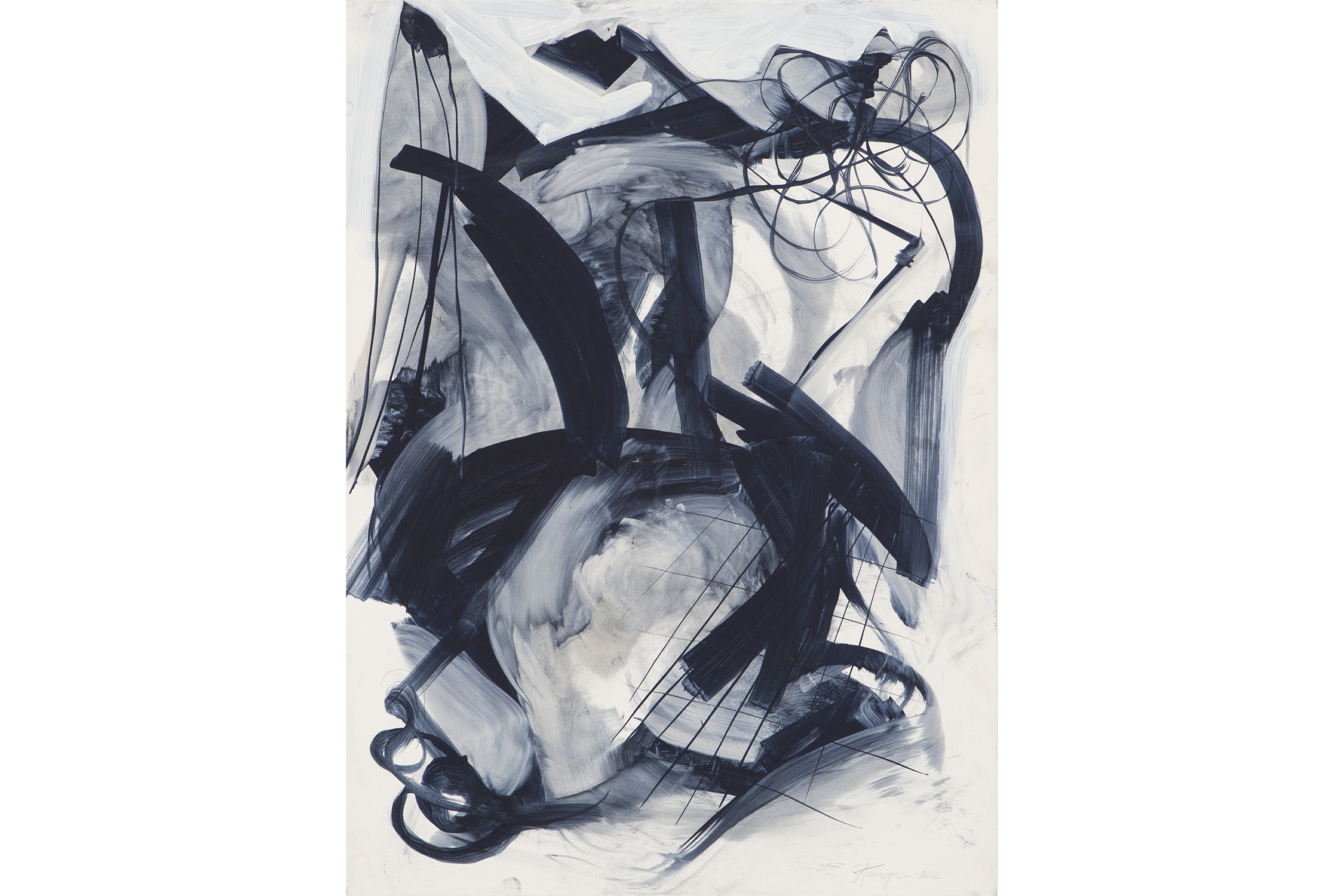
TUMBLEWEED BY MAURA SEGAL

Maura Segal is an artist working out of Los Angeles, California. Drawing inspiration from the contrasting natural and developed landscapes, she paints canvases that articulate these unions. The layers of Segal’s paintings are most telling, featuring a bed of hand cut pieces of paper that get painted over. These subtly collaged pieces are scattered like stray plants in the desert. Segal then paints squares and rectangles of various sizes to further cut up or distribute the field. On some of her paintings, layers of thinly cut paper are attached that mimic the flight of a bee as much as a network of highways and roads. These processes confuse the notions of natural and developed through their depiction of shapes. In doing so, Maura Segal has found a unique way to tap into her environment and unravel the strangeness of it.

marlee power
FEATURED IN DECEMBER

SLEEP BY TED STANUGA

Wrapping his composition with frothy, energetic brushstrokes; Stanuga’s Sleep supports itself through the tension in its lines. Wide, rigid brush strokes of varying transparency connect across the picture to form spaces where washes of light grey and deep blue flow. Spindly, bent lines contrast a net of ribbonlike forms. Below them, converging planes overlay a foggy atmosphere. Stanuga’s refined sensibility from decades of painting is made clear in this work on paper. 

SET OF ADRIAN PEARSALL LOUNGE CHAIRS

Often overshadowed by Kagan and Noguchi, Pearsall doesn’t get quite the same recognition for his groundbreaking designs of the 1960s. After selling Craft Associates to Lane Furniture Company in 1968, Pearsall went on to form Comfort Designs with John Graham. Drifting away from the Atomic Age design’s preference for free flowing wood and glass, Pearsall moved into solid, angular geometry consistent with futuristic styles of the 1980s. Reupholstered in vintage linen velvet, these two lounge chairs have a rich, saturated color whose linear forms respond elegantly to light.

HARVEY PROBBER ROSEWOOD DRESSER

Harvey Probber took on the second half of the 20th Century quite differently from Pearsall, focusing instead on simple geometric shapes made with elegant materials. While never stylistically approaching the forms that other avant-garde designers were interested in, Probber pioneered the concept of modular furniture. His furniture is carefully designed to interact dynamically with other geometries in both the room and furnishings. Some of his more iconic pieces, like the Cubo sofa, show how simple rectangles, stacked on top of each other, form an elegantly rectilinear sofa. This rosewood dresser from the 1960s operates on the same design principles. Masterful craftsmanship, alongside beautiful proportions create a simple, understated, but wholly beautiful piece of furniture. 

Guest User
FEATURED IN NOVEMBER

CHICAGO VINTAGE 1980 BOXING PHOTOS

Phil Mascione’s dynamic composition draws your eye through the picture with the angled lines of the building’s walls. He has skillfully positioned the camera to include figures on each edge of this photograph. A musician warms up in the background, a distracted boxing coach has a conversation to the right, and a discerning spectator eyes the boxer for the far left. Each figure in this photograph draws you back to the subject, the boxer preparing for his match. In a striking way, Phil Mascione manages to convey the drama of the moment in one frame.

LAWRENCE PEABODY FOR RICHARDSON NEMSCHOFF SETTEE

The smooth forms of Lawrence Peabody are instantly recognizable. His rhythmic, elegant lines often give the feeling of a bend, rather than a curve. During his design career, Lawrence Peabody spent much of his time designing for the notable companies Kohler, Sears, Roebuck & Company, Richardson Brothers, and Boyd Lighting while also designing hotels in the US and Caribbean. However, his most refined, enduring work was made for the Richardson Nemschoff furniture company. This settee exemplifies Peabody’s ability to incorporate swooping, graceful curves into bold, well rounded design.

CENDESE PULCINO SCULPTURE

For this piece, Antonio da Ros worked with the Murano glass factory Ars Cendese. The factory itself is part of the rich glassmaking history of Murano. Glass production on Murano started over a millennium ago in 982. During the Renaissance, the production of new types of glass, most notably crystal clear glass, increased demand greatly. Subsequently, the skillfully crafted Murano glass was highly sought after by the upper class of Europe. The Murano glass factories survived the end of the Venetian Republic, starting a new push to develop the art of glasswork even further. Murano’s history of technical mastery in ornate, elegant colored glass shines in this Antonio da Ros sculpture.

Guest User
A Closer Look at As We Enter New Planes
Standing Tall by Ruth Aizuss Migdal, 2009. Stoneware. Photograph courtesy of gallery.

Standing Tall by Ruth Aizuss Migdal, 2009. Stoneware. Photograph courtesy of gallery.

   In Ruth Aizuss Migdal’s Standing Tall, a leg bends suggestively towards the viewer. In her early career Migdal was an abstract expressionist painter, and her sensitivity to the particulars — very much like a painter who very carefully places paint on the canvas — shows itself in the care and attention Migdal gives to exalting organic curvature. Her decisive hand is very apparent and steady. Very much like in abstract expressionism, Migdal has captured a moment and frozen it in time. Standing Tall is still and in motion at the same time. One could imagine the leg’s bending curvature to change any moment.

   Migdal’s work goes beyond simple physical representation of an object. Standing Tall stands as an image of unabashed power, unshaken by its environment. The gesture has been forever immortalized in stoneware.

    At the heart of Migdal’s sculpture is the twofold act of deconstruction and reconstruction. Separating the body from its usual unified context provides the basis of the language Migdal explores and scrutinizes. She undertakes the fragmentation of her subject to underline the gaps in the presence of sculpture. Separate pieces of cast bronze components are treated as puzzle pieces, which Migdal assembles to create new arrangements. She asks us to consider equally what is there physically and what isn’t there. Her work is as additive as it is subtractive.

Scattered Floes by Nicholas Kriefall, 2016. Oil on canvas. Photograph courtesy of the gallery.

Scattered Floes by Nicholas Kriefall, 2016. Oil on canvas. Photograph courtesy of the gallery.

     This sense of duality is closely examined in our autumnal show, As We Enter New Planes, featuring sculptures by Migdal and paintings by Nicholas Kriefall.

      Kriefall’s work approaches the mystery of this duality in a different way. He is reliant on the flatness canvas provides. He counters the limitations of flatness by applying multiple layers of thick paint, creating multifarious texture and depth as he investigates the mysteries of the natural world. His landscapes are not readily discernible. Extremely painterly, they are a departure from a traditional understanding of landscape. Kriefall hints at the suggestion of a horizon line in his paintings, but ultimately the eye has no real place to land. This creates a displacement for the viewer.  Instead of being reliant on recognizable representational elements, Kriefall anchors himself in the manifestation of feeling. He deconstructs in order to reconstruct. The viewer arrives at an external representation of an internalized feeling. Kriefall is constantly translating his feelings into something seemingly more tangible, concrete.

      In Scattered Floes we see mystery’s veil shrouding our vision. Kriefall evokes the experience of floating sheets of ice through a blend of white, blue and black. These are the colors of this scene happening in the natural world. The purity of the ice and the water underneath bring out a blackness when they meet together and turn into one. An impenetrable depth is created. The work speaks to the natural way of how things change, develop and in strange ways, come together as one.

   Together Migdal and Kriefall ask us to take a considered glance at the body and surroundings.

   As We Enter New Planes is on view at the gallery until November 12. The gallery is open Tuesday through Sunday, 11 - 6 pm.

Guest User
FEATURED IN OCTOBER

GLASS BOTTLE VASE BY KASTRUP HOLMEGAARD

This hand blown glass vase comes from the internationally known Kastrup Holmegaard factory. In 1936, Otto Brauer was hired by Kastrup Glasværk (later known as Kastrup Holmegaard) as a glassblower. After 10 years of honing his craft, Brauer was awarded the title of Master. A decade after that, the Gulvase went into production. The olive green color is one of their most well known designs, and preceded the brightly colored versions. This Gulvase’s immaculate craft, rich olive green color, and untraditional shape make it a great contrast piece to other rectilineal MCM designs.

SET OF LE CORBUSIER LC2 CHAIRS

Debuting at the 1929 Salon d’Automne in Paris to later be re-issued by Cassina in 1965 this set of armchairs by Swiss-French designer and architect, Le Corbusier is truly timeless. Despite his avant-garde designs for his time, Le Corbusier made sure to prioritize functional logic in all his products. The cushions in this set have been reupholstered in a deep orange suede that poses a warm, rich texture next to the slick chromed steel frame.

WROUGHT IRON SCULPTURE

Hand sculpted by a local Chicago artist in the 1960s, this wrought iron floor sculpture lends itself to a brutalistic approach in its design. The term brutalism, originating from a French word meaning raw, aptly describes the organic and textured nature of the craftsmanship present in this piece. The two eyes on the front of this sculpture bring it to life in a playful and charming way. This is an enjoyable addition to any minimalist home seeking to further its art collection.

Guest User