A Closer Look at As We Enter New Planes
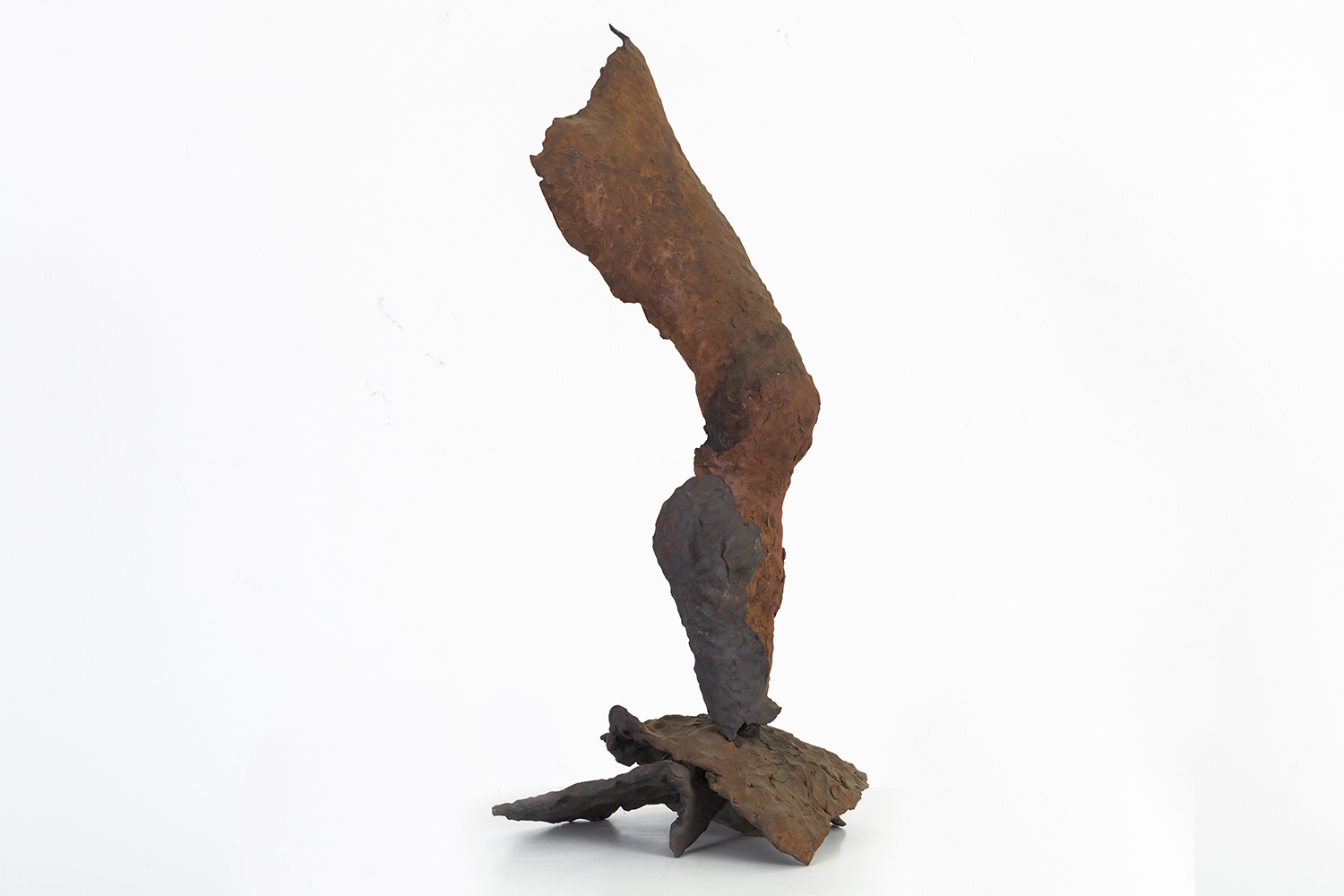
Standing Tall by Ruth Aizuss Migdal, 2009. Stoneware. Photograph courtesy of gallery.

Standing Tall by Ruth Aizuss Migdal, 2009. Stoneware. Photograph courtesy of gallery.

   In Ruth Aizuss Migdal’s Standing Tall, a leg bends suggestively towards the viewer. In her early career Migdal was an abstract expressionist painter, and her sensitivity to the particulars — very much like a painter who very carefully places paint on the canvas — shows itself in the care and attention Migdal gives to exalting organic curvature. Her decisive hand is very apparent and steady. Very much like in abstract expressionism, Migdal has captured a moment and frozen it in time. Standing Tall is still and in motion at the same time. One could imagine the leg’s bending curvature to change any moment.

   Migdal’s work goes beyond simple physical representation of an object. Standing Tall stands as an image of unabashed power, unshaken by its environment. The gesture has been forever immortalized in stoneware.

    At the heart of Migdal’s sculpture is the twofold act of deconstruction and reconstruction. Separating the body from its usual unified context provides the basis of the language Migdal explores and scrutinizes. She undertakes the fragmentation of her subject to underline the gaps in the presence of sculpture. Separate pieces of cast bronze components are treated as puzzle pieces, which Migdal assembles to create new arrangements. She asks us to consider equally what is there physically and what isn’t there. Her work is as additive as it is subtractive.

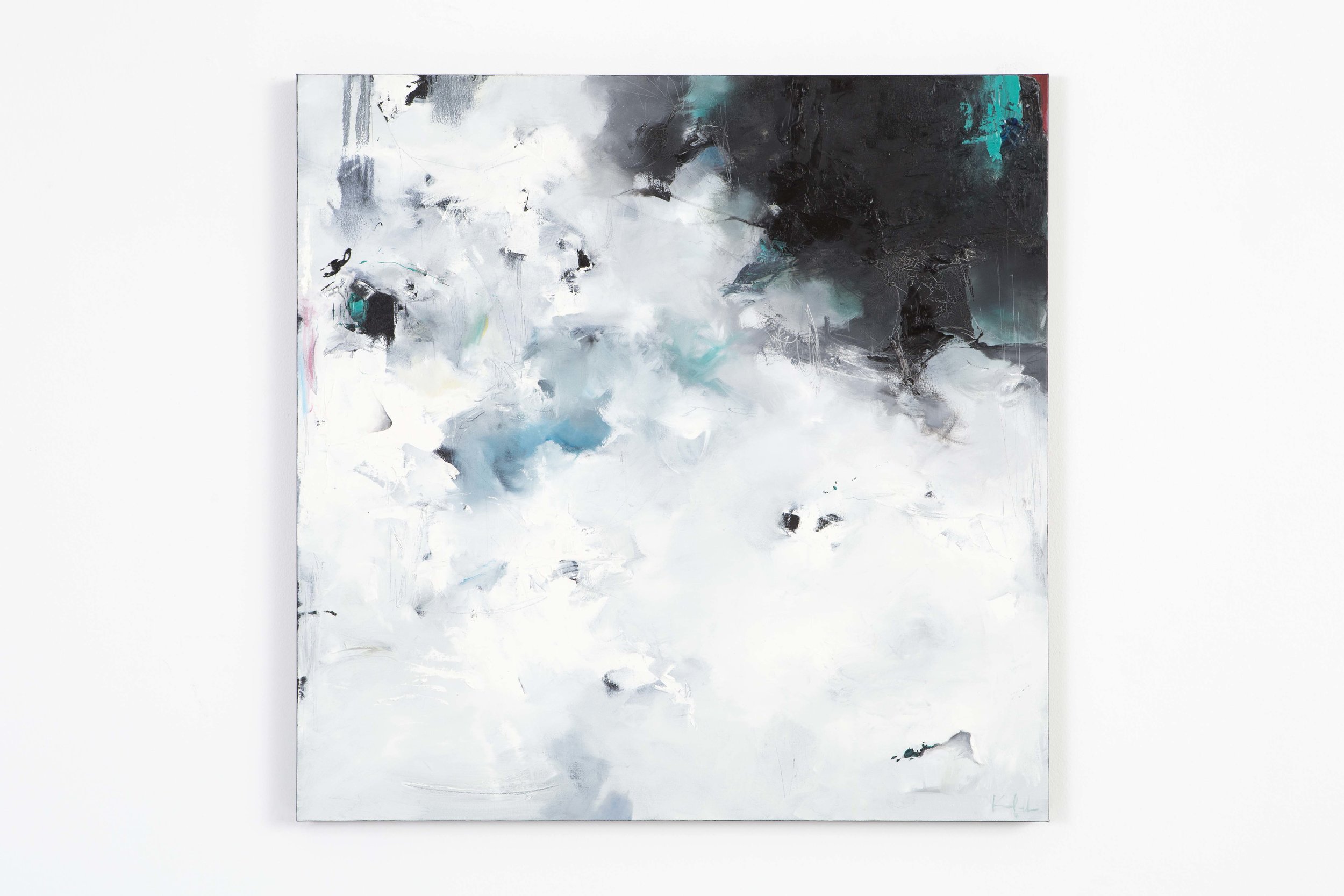
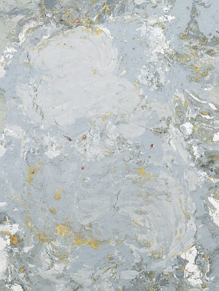
Scattered Floes by Nicholas Kriefall, 2016. Oil on canvas. Photograph courtesy of the gallery.

Scattered Floes by Nicholas Kriefall, 2016. Oil on canvas. Photograph courtesy of the gallery.

     This sense of duality is closely examined in our autumnal show, As We Enter New Planes, featuring sculptures by Migdal and paintings by Nicholas Kriefall.

      Kriefall’s work approaches the mystery of this duality in a different way. He is reliant on the flatness canvas provides. He counters the limitations of flatness by applying multiple layers of thick paint, creating multifarious texture and depth as he investigates the mysteries of the natural world. His landscapes are not readily discernible. Extremely painterly, they are a departure from a traditional understanding of landscape. Kriefall hints at the suggestion of a horizon line in his paintings, but ultimately the eye has no real place to land. This creates a displacement for the viewer.  Instead of being reliant on recognizable representational elements, Kriefall anchors himself in the manifestation of feeling. He deconstructs in order to reconstruct. The viewer arrives at an external representation of an internalized feeling. Kriefall is constantly translating his feelings into something seemingly more tangible, concrete.

      In Scattered Floes we see mystery’s veil shrouding our vision. Kriefall evokes the experience of floating sheets of ice through a blend of white, blue and black. These are the colors of this scene happening in the natural world. The purity of the ice and the water underneath bring out a blackness when they meet together and turn into one. An impenetrable depth is created. The work speaks to the natural way of how things change, develop and in strange ways, come together as one.

   Together Migdal and Kriefall ask us to take a considered glance at the body and surroundings.

   As We Enter New Planes is on view at the gallery until November 12. The gallery is open Tuesday through Sunday, 11 - 6 pm.
Guest User
FEATURED IN OCTOBER

GLASS BOTTLE VASE BY KASTRUP HOLMEGAARD

This hand blown glass vase comes from the internationally known Kastrup Holmegaard factory. In 1936, Otto Brauer was hired by Kastrup Glasværk (later known as Kastrup Holmegaard) as a glassblower. After 10 years of honing his craft, Brauer was awarded the title of Master. A decade after that, the Gulvase went into production. The olive green color is one of their most well known designs, and preceded the brightly colored versions. This Gulvase’s immaculate craft, rich olive green color, and untraditional shape make it a great contrast piece to other rectilineal MCM designs.

SET OF LE CORBUSIER LC2 CHAIRS

Debuting at the 1929 Salon d’Automne in Paris to later be re-issued by Cassina in 1965 this set of armchairs by Swiss-French designer and architect, Le Corbusier is truly timeless. Despite his avant-garde designs for his time, Le Corbusier made sure to prioritize functional logic in all his products. The cushions in this set have been reupholstered in a deep orange suede that poses a warm, rich texture next to the slick chromed steel frame.

WROUGHT IRON SCULPTURE

Hand sculpted by a local Chicago artist in the 1960s, this wrought iron floor sculpture lends itself to a brutalistic approach in its design. The term brutalism, originating from a French word meaning raw, aptly describes the organic and textured nature of the craftsmanship present in this piece. The two eyes on the front of this sculpture bring it to life in a playful and charming way. This is an enjoyable addition to any minimalist home seeking to further its art collection.

Guest User
Exploring Herman Miller's Legacy
A survey of Herman Miller catalogues. To the right hand corner is the famous hardcover product catalog designed and written by George Nelson from 1948. In the foreground is Life Magazine's article on Nelson and his Storagewall Design. It caught D.J.…

A survey of Herman Miller catalogues. To the right hand corner is the famous hardcover product catalog designed and written by George Nelson from 1948. In the foreground is Life Magazine's article on Nelson and his Storagewall Design. It caught D.J. De Pree's eye in 1945. Photograph by Martha Morimoto.

   The George Nelson Platform Bench. The Charles + Ray Eames DCM chair. Alexander Girard's beautiful and colorful textile work. The Isamu Nogochi glass-topped coffee table. All of these pinnacles of modernism that put American design on the map come from one name: Herman Miller.

    It's hard to imagine the landscape of American design without Herman Miller. In 1923, Herman Miller was still the Michigan Star Furniture Company, a manufacturer of high-quality, traditional-style bedroom bed suites when D.J. De Pree, its owner, convinced his father-in-law, Herman Miller, to purchase majority of the company’s shares. Grateful for his father-in-law’s trust, De Pree renamed the company Herman Miller.

Gilbert Rohde. Photograph by Luis Lemus.

Gilbert Rohde. Photograph by Luis Lemus.

  The company was still making bedroom bed suites when the Great Depression hit in the 1930s.  On the verge of bankruptcy, De Pree needed to revitalize his company quickly. On a trip to New York, De Pree was intrigued by Gilbert Rohde's vision of creating furniture better suited for the American public. This chance meeting with Rohde would be the beginning of the Herman Miller brand we know today.

   We recently visited Herman Miller’s headquarters in Zeeland, Michigan. The tour included a look at the premises and archives, the production of the Aeron Chair as well as chatting with R&D.

  History runs deep in Herman Miller’s ethos. Keeping true to Rhode’s original mission of creating better furniture suited for the American public, the company's past continues to inspire the present.

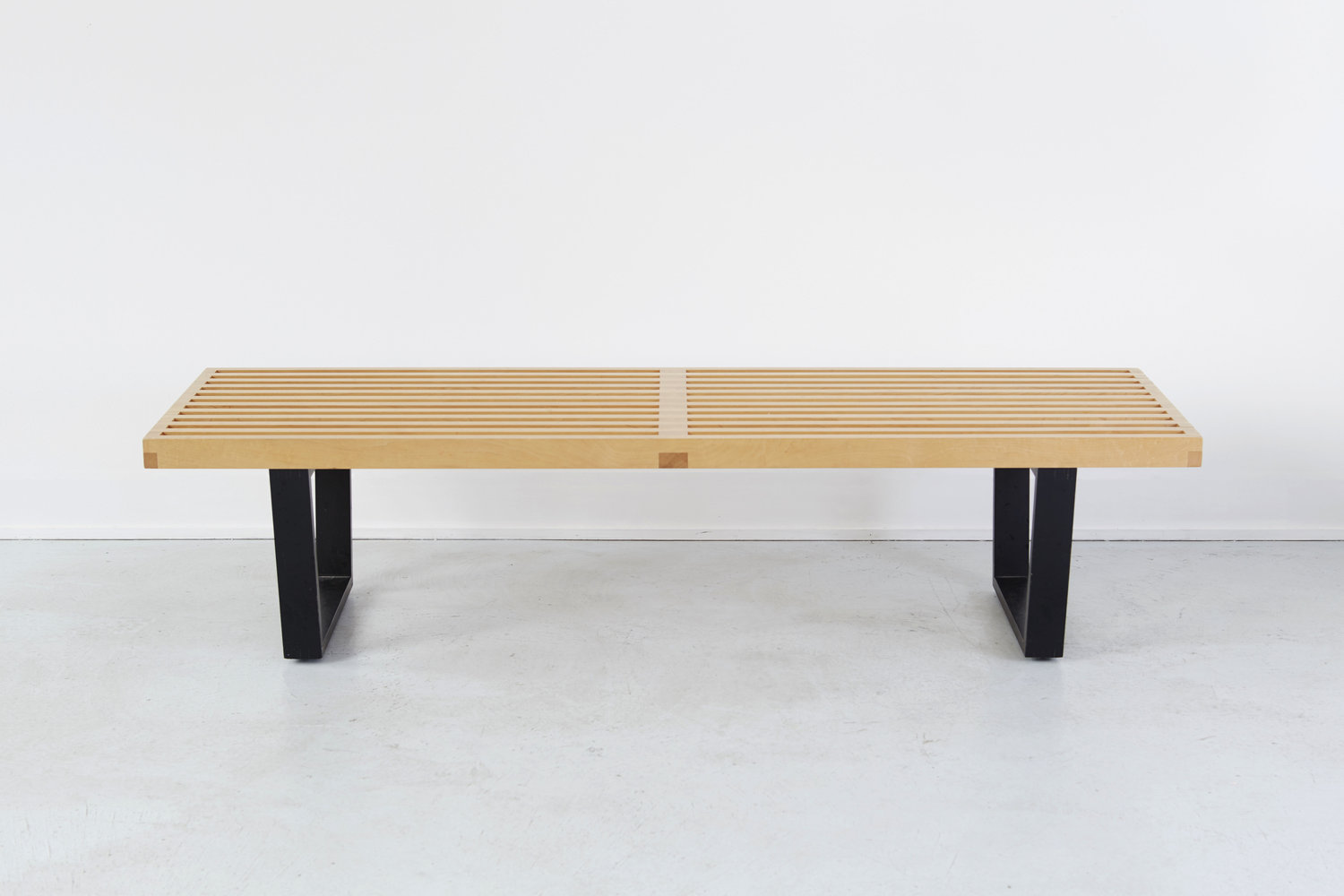
George Nelson's Platform Bench for Herman Miller. Photograph courtesy of the gallery.

George Nelson's Platform Bench for Herman Miller. Photograph courtesy of the gallery.

George Nelson's Slat Bench for Herman Miller. Photograph courtesy of the gallery.

George Nelson's Slat Bench for Herman Miller. Photograph courtesy of the gallery.

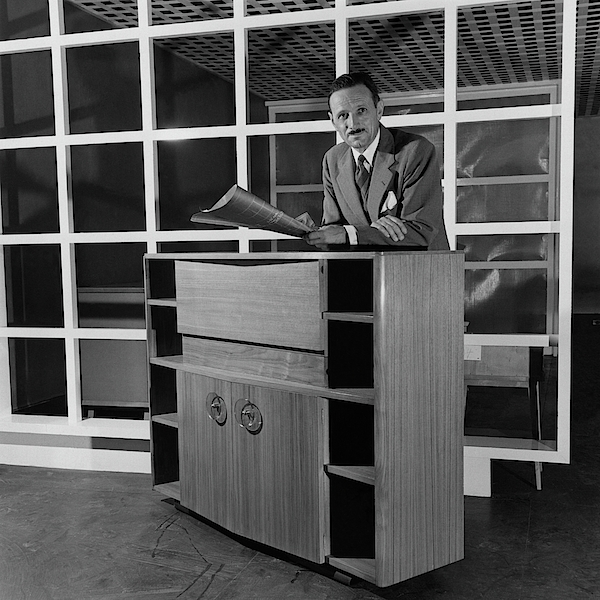
   Rohde died in 1944 and De Pree hired George Nelson to be the new Design Director after seeing Life Magazine’s article on Nelson and his Storagewall Design. Pinnacles of American modernism followed in the next few years, contributing to the canonical design movement, Mid-Century Modern. Nelson created the Platform Bench to be straightforward and versatile.

   Herman Miller’s primary focus of the 90s was producing the Aeron chair. In 1994, Bill Stumpf and Don Chadwick designed this chair to be made out of 94 percent recyclable material. The Aeron chair created a revolution in the workplace. What differentiates this chair is its focus on good posture while providing lower back support alleviating the back pain arising from sitting in an office all day. It has no foam, fabric or leather.

A peek at the Living Office at Herman Miller's Design Yard. Fabric panels and designs by Alexander Girard are sprinkled throughout the space. Photograph by Martha Morimoto.

A peek at the Living Office at Herman Miller's Design Yard. Fabric panels and designs by Alexander Girard are sprinkled throughout the space. Photograph by Martha Morimoto.

Our set of Alexander Girard + Peter Protzman dining chairs designed for Herman Miller, c 1960s. Original upholstery. Photograph courtesy of the gallery.

Our set of Alexander Girard + Peter Protzman dining chairs designed for Herman Miller, c 1960s. Original upholstery. Photograph courtesy of the gallery.

    We learned about Herman Miller's on-going project: redefining the American work office. How we work and interact with one another is constantly changing. The office environment should be a reflection of these changes. Living Office is Herman Miller's philosophy of a high-performing office space which creates a free-flowing efficient work experience. The urge towards innovation works in the company's spirit of creating a better suited environment for the needs of American working class.

      Upon leaving the premises, we were gifted an unexpected present.

   In 1995, Herman Miller opened a new manufacturing facility in Michigan. Built in the middle of lush meadows and flora, the facility dubbed The Greenhouse was an example of the company's move to sustainable environmental building practices. In 2000, things weren't looking that great. Paper wasps, known for their aggressive nature, had invaded the facility. The flowers weren't blossoming as expected. In a last effort to save the wilting project and in compliance of the Greenhouse's no-pesticides policy, honeybees were introduced. Not only did they cross-pollinate the flowers, they also took over the wasps' main food source.

    A beautiful, unexpected by-product of their presence no one had considered initially? Honey. Our trip ended on a sweet note.

Guest User
Interview with Hannah Perry Saucier

We sat down with Hannah Perry Saucier about her solo show The Chip, currently on display at the gallery.

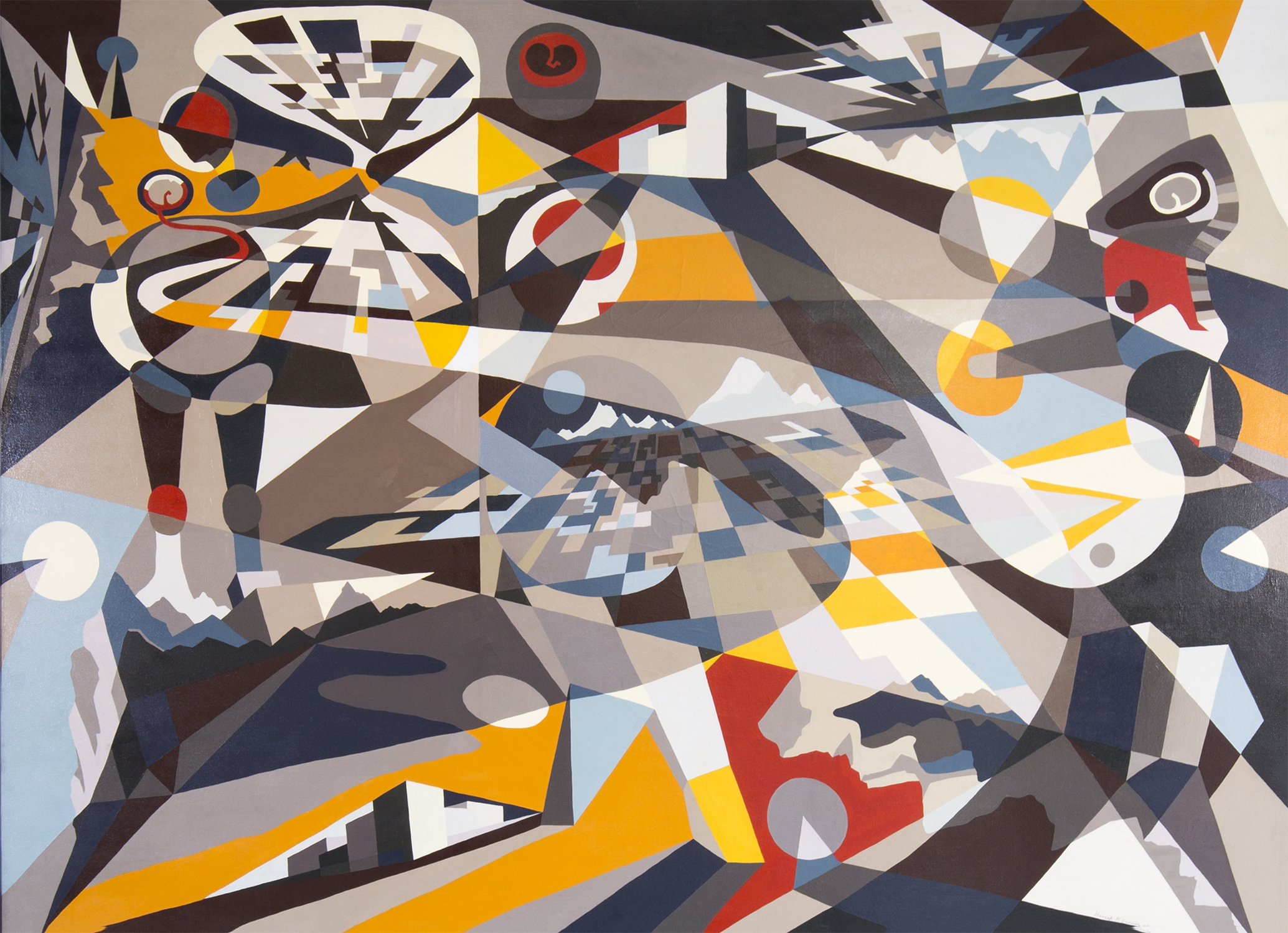
Shapeshifting by Hannah Perry Saucier, 2014. Oil on canvas, framed. Image courtesy of the gallery.

Shapeshifting by Hannah Perry Saucier, 2014. Oil on canvas, framed. Image courtesy of the gallery.

MATTHEW RACHMAN GALLERY: How do you think about landscape?

HANNAH PERRY SAUCIER: Everything is fragmented for me. I fracture things in my mind [as opposed to] seeing them as one, singular being. I really love the geometry I find when looking at things. I don’t always find this kind of geometry around me, but light and dark spaces are particularly suggestive of value—in my way of painting, I see similarities in landscape and portraiture.

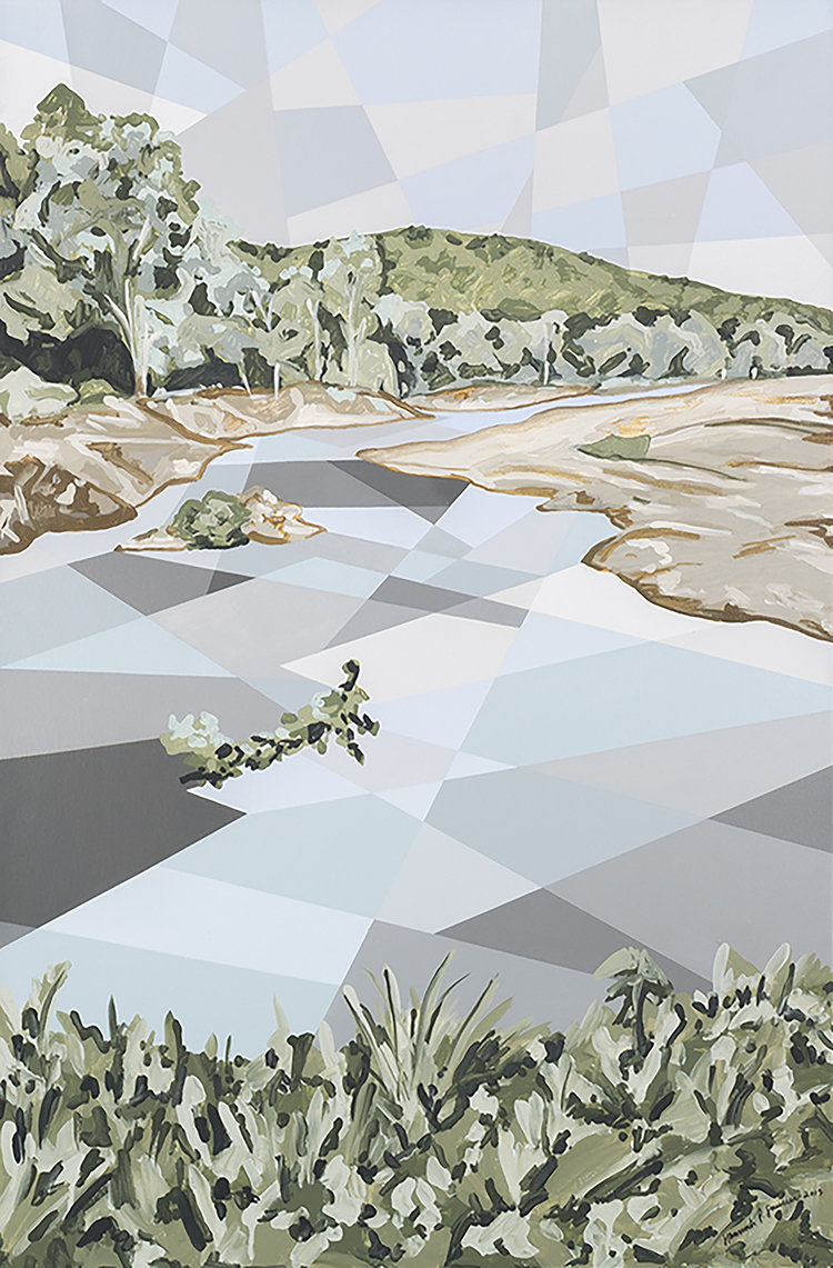
   The newer landscapes I’m doing nowadays still have geometric elements such as a geometric sky or water, but [they are now] combined with more traditional painterly effects. I wanted to start blending the two together to have a juxtaposition of the organic forms with geometric ones.

Current of Niangua by Hannah Perry Saucier. Acrylic on canvas, framed. Image courtesy of the gallery.

Current of Niangua by Hannah Perry Saucier. Acrylic on canvas, framed. Image courtesy of the gallery.

MRG: I was actually wondering about the relationship between the organic and geometric in your work. Your paintings have very flat and graphic elements, but they are combined with organic and primal shapes.

HPS: I have a tendency to over-calculate in my work. Before I set out to paint, I sketch everything out and have everything set in place. The applying of color changes elements here or there, they will shift in the process. Nonetheless, I would be filling in my initial composition.

   I felt that I needed to find a way to break out of this tendency. One direction I took was to do one section of a given painting in a very solid, graphic manner while doing another part, like the trees and grass, in a very fluid and playful manner.

   Untitled is an example where the improvisation comes with through the forms themselves, although they retain their graphic flatness.

MRG: Your use of color is very bold. Your color choices make me think about how I remember things. I feel like because memory can heighten or over exaggerate the certain aspects of a given recollection—there's a certain brightness, vividness to those specific parts. Do your colors have any relationship?

HPS: Color, for me, is very intuitive. I dream in color; my memories are in color. My sense of sight above the other senses is much stronger as well, but I think, particularly, in the way I see colors.

   Shapeshifting is a representation of a past, present and future self; there’s three selves embedded within the landscape, and the landscape, in turn, is embedded in the figure. We’re inside the landscape physically, and the landscape is inside our minds. We’re perceiving it at all times. The present self is moving [in the work], and above the self's head there’s a little orb, containing a thought inside of it. The thought is red. For this one element, the use of color was very intentional. Anxiety of being in the present moment, moving through thoughts which can be stressful or painful.

   I use color in the way it comes to me. I try to balance color in terms of value and tone to create a sense of rhythm. Nowadays I’m simply drawn to colors. I mix all of my colors. I don’t use anything from tube; I mix until I get the colors I want. I’ll shift my colors a bit as I'm applying them on canvas, once I see how the colors are responding to one another.

MRG: What is memory for you?

HPS: Everyone has a plethora of memories, even a person who’s lived in the same place all their life is going to have a wealth of experiences, things that have happened to them. I’ve lived in five different countries in my life so far, and done a lot of traveling.

   This body of work comes from a sketch I made for a class where we had been prompted to make a self-portrait. At that point in my life, I was thinking a lot about all the experiences I had accumulated from living in places that were all so different from one another, and how, despite all of this, I was still one person. I felt very fragmented in certain ways. I would go into certain situations, and find myself in a certain role for a little while before having to shift mentally when going back to another culture, job, school.

    The work for the project was originally more symbolic. Made out of orbs, I had a figure connected together with lines. Inside [each orb] there was an image representing a fragment of a place I had lived in, or, a feeling I had felt at the time. It was a meditation into the relationships these fragments had to one another. Eventually, I turned the sketch into a painting where all these different orbs with their contained imagery became connected geometrically. I think all you’ve done or experienced in life is somehow always within you. Depending on what you’re focusing on or where you are, different aspects of your being are much stronger and present than others; but everything still is embedded in you somewhere.

   When I made the move from symbolism to abstraction in my work, I started thinking about how certain memories begin to fade. You either completely forget about them, or you begin to remember only certain aspects of the memory. The specific symbolism is gone; the forms become more and more abstract until, eventually, they are reduced to pure form.

Eye of the Moon Storm by Hannah Perry Saucier, 2015. Mixed media on canvas, framed. Image courtesy of the gallery.

Eye of the Moon Storm by Hannah Perry Saucier, 2015. Mixed media on canvas, framed. Image courtesy of the gallery.


When I made the move from symbolism to abstraction in my work, I started thinking about how certain memories begin to fade. You either completely forget about them, or you begin to remember only certain aspects of the memory. The specific symbolism is gone; the forms become more and more abstract until, eventually, they are reduced to pure form.


MRG: Does scale influence the way you work?

HPS: The truth, if I could, I would be working large scale pieces all the time. It's not always possible to be working on multiple, giant pieces at the same time with the space I have, so I end up having to work smaller. With that said, though, each individual [geometric] piece in each painting is a smaller piece of work in itself. The little details, even in their flatness, become their own environment.

    Untitled, Shapeshifting and Wiggle World (The World is Wiggly), mostly layered oil paint pieces, are all completely painted by hand—without the help of tape. Untitled has a bit of acrylic in it, but this is indiscernible because of the paint's matte quality. You need to look at the work very closely to see the little details of the brushstroke, texture of the canvas. In my smaller works, these details create far more intimate spaces. Whereas looking at Shapeshifting each fragment is much larger—there’s more going on within [that] given section. This creates a different experience for me and the viewer. When I’m creating smaller works, I’m more enclosed in them and with bigger works, the process feels far more physical.

MRG: A lot of aspects in your work suggest total control: you’re mixing your own colors, making your own frames. You stretch your own canvas. There’s a lot of self-agency in your work.

HPS: I think you’ve picked up on a big aspect of my personality, my trying to control things… which is why, (laughs), in my newer works, I’ve been making an effort to let things go, to make more improvisational works. The Wiggle World (The World is Wiggly) is reflective of my trying to let go. I had initially sketched it out as I usually do with my works, but in the process of filling it out, I started to create some impromptu forms— I was no longer figuring it out in a strictly mathematical way. •

The Chip, Paintings by Hannah Perry Saucier, runs through to September 17, 2017 at Matthew Rachman Gallery.

ABOUT THE ARTIST: HANNAH PERRY SAUCIER RECEIVED HER BFA FROM THE SCHOOL OF THE ART INSTITUTE OF CHICAGO, AND HAS STUDIED IN ISTANBUL, TURKEY (HISAR EGITIM VAKFI, 2008-2009), PRETORIA, SOUTH AFRICA (THE UNIVERSITY OF PRETORIA, 2012), SAUGATUCK, MICHIGAN (OX-BOW SCHOOL OF ART, 2013), AND FURTHERED HER WORK IN BANGKOK, THAILAND. SHE CURRENTLY LIVES IN BARCELONA, SPAIN.

Guest User
FEATURED IN AUGUST

SET OF JENS RISOM LOUNGE CHAIRS

Take special notice of the frames of these lounge chairs, as Jens Risom was one of the first designers to bring Scandinavian design into American furniture. The rich plum velvet would serve well in a living room needing dark color.

SET OF DCM CHAIRS

Introduced in 1946, the DCM chair by Charles and Ray Eames is easily an archetype of American design. The seat and back of chair easily mold to fit the contours and angles of any body, providing comfort without the addition of upholstery. This design eliminates bulky detail and creates a smooth, elegant and versatile chair that is equally at home in a dining or a conference room.


VICO MAGISTRETTI MARALUNGA CHAIR + OTTOMAN

Winner of Italy’s Compass D’Oro award for Industrial Design in 1979, Vico Magistretti’s Maralunga chair and ottoman set for Cassina is a striking blend of functionality and beauty. Magistretti’s chair features an adjustable backrest for two very different looks and comfort. The juxtaposition of the dyed cowhide and patterned cotton provides this set with a range of texture and a bold color scheme that makes for the quintessential statement piece.

Guest User